Chapter 1
Types of Variables
Summarizing, describing or exploring, the data starts by categorizing the data and the observed
values into qualitative variables1 (Nominal and ordinal) or quantitative variables (Interval and Ratio).
+ Nominal variables are pre-made classes of
certain characteristics or events, however the
categories are not ordered and the difference in
between scores have no meaning. (Mode)
+ Ordinal variables have a ranking, however
the difference in between adjacent values is
unequal. (Mode, Median; IQR)
+ Interval variables have arbitrary zero’s and
can have negative values, are ranked and the
difference in between adjacent values is equal at all
times. (Mode, Median, Mean; Range, Variance, SD
and IQR, no multipliers)
+ Ratio variables are ranked, have absolute
zero’s (0 means that the value is absent) and
difference are equal. (Mode, Median, Mean; Range,
Variance, SD and IQR, ‘multiplying is allowed’)
Types of Tables
Summarizing the data values will be done in tables or graphs, these tables or graphs contain all the
values observed in the experiment/study and give a quick overview of the frequency and the range of
each and every value or sub-group of certain values.
+ Frequency tables contain certain values and give the frequency of these specific values,
however they also give the percentage of one specific value and they give an overview of the
cumulative percentage.
+ Bar charts are graphs that contain a specific score on the horizontal X-axis while showing
the frequency for each and every score on the vertical Y-axis, most often the X-axis contains
qualitative variables. A bar chart has a small gap in between each and every chart/range of values, it
also very easily shows the mode of the data set.
+ Histograms look roughly the same as bar charts, however histograms have charts that
touch each other (exceptions for when a specific value has a frequency of 0) and histograms contain
quantitative values on their X-axis. Also the charts in a histogram contains a wide spread range of
values instead of one single value in specific (though only one single value is also possible, but rarely
seen).
To construct a histogram the value have to be organized in groups with an equal range in
variances for each bar, and the frequency has to be found. The range is given by brackets and
parenthesis; brackets include the value and parenthesis exclude the value, thus [5, 6) “5 to 5.99”.
A histogram most often shows the area of bar as the frequency, due to this fact a wider range often
results in dividing the frequency by the range, in such way the bigger range and lower frequency
cancel each other out and the area will be equal to the frequency. For very big sample sizes most
often (relative) percentages on the Y-axis will be chosen instead of the frequency in numbers.
1 Or Categorical or Discrete Variables
1
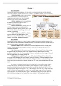
, If histograms use very big sample sizes mainly one of the three following (one peaked) distributions
will be created, a positive or negative skewed or a symmetrical distribution.
+ Negatively skewed graphs have their tail on the left side
and the peak on the right side, due to this the frequency on the right
is high, while the median still lies in the middle but the tail highly
lowers the mean of the data set;
Mean<Median<Mode.
+ A normal, symmetrical or Gaussian distribution is
symmetrical on both sides of the peak, because of this;
Mean=Median=Mode.
+ Positively skewed graphs have their tail on the right side
and the peak on the left side, due to this the frequency on the left is
high, the median is in the middle and the mean is highly increased
due to the tail on the right;
Mode<Median<Mean
There also are other distributions possible, for example multiple peaked ones, a steeper peak or a
very broad peak, but no matter what the distribution looks like the area under the graph always equal
1 (while all measurements together form 100%).
Central Tendency
The central tendency are multiple parameters that give a summary of all the measured values in a
data set, there are three measurements of central tendency.
+ The median is the middle most number of the values of the data set, after they are ranked
to increasing value, if the data set has an odd amount of values it is just the middle number, however
when the database has an even amount of values then it is the median of the two middle most
numbers. The median splits the data set up in 50% of values lower than the median and 50% of the
values higher than the median.
The median is very resilient, as long as no values are added an outlier (thus instead of a normal value)
will not influence the median whatsoever; the median is a very resilient parameter.
+ The mode is the value with the highest frequency of the data set values.
+ The (Arithmetic) mean of a data set is the average of the data set, calculated by adding all
values together and dividing by the sample size (amount of values); μ =
∑X . The mean is easily
N
influenced by outliers of the data set, it will alter towards the values of these extremes.
The arithmetic mean is not very resilient.
Measure of Spread
Measurements of spread give a summary of the range of all the values of the data set, the central
tendency only gives ‘middle number’ of the data set, however not the range or variance of the
population around these middle point.
+ The range gives the difference between the maximal and minimal measured value;
Range = Maximal X – Minimal X
+ The variance (σ2) and standard deviation (σ) are interchangeable with each other due to the
fact that the standard deviation is the square root of variance. Both of these measurements give an
indicator of the average difference between the mean and the actual observed values, SD however
has the same dimension as the values, variance has the dimension squared.
n
Variation (X )
Variation (X) = ∑ ( X− X́ )2 (Notice; Variance (σ2) =
N
)
i=1
2
The benefits of buying summaries with Stuvia:
Guaranteed quality through customer reviews
Stuvia customers have reviewed more than 700,000 summaries. This how you know that you are buying the best documents.
Quick and easy check-out
You can quickly pay through credit card or Stuvia-credit for the summaries. There is no membership needed.
Focus on what matters
Your fellow students write the study notes themselves, which is why the documents are always reliable and up-to-date. This ensures you quickly get to the core!
Frequently asked questions
What do I get when I buy this document?
You get a PDF, available immediately after your purchase. The purchased document is accessible anytime, anywhere and indefinitely through your profile.
Satisfaction guarantee: how does it work?
Our satisfaction guarantee ensures that you always find a study document that suits you well. You fill out a form, and our customer service team takes care of the rest.
Who am I buying these notes from?
Stuvia is a marketplace, so you are not buying this document from us, but from seller DirelessWolf. Stuvia facilitates payment to the seller.
Will I be stuck with a subscription?
No, you only buy these notes for $7.34. You're not tied to anything after your purchase.